 A property manager needs to analyze costs over time to gain meaning, observe trends, and to prepare realistic budgets. The information prepared can be insightful for owners, board members, departmental work, and interpretation for users.
Below are two examples.
Graph #1. 5-year monthly comparison

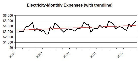
Graph #2. 5-year summary with trendline. Same data, graphed to show the 5-year trend.

To download a free Excel template, so you can easily make these same graphs, click here
Principles
- Use a minimum of 3 years of data, preferably 5 years, for more accurate trend analysis.
- Use graphics, as much as possible. Sometimes it’s appropriate to include a table of the data as well.
- Include an interpretation of the graphics, such as relating electricity costs to usage, rate changes/increases, weather factors, conservation efforts, etc.
